The second, flaghumpinger incarnation of the XFL is, it appears, truly actually happening next spring. Landry Jones is in and the league has real teams and everything! Unfortunately, these are those teams.
The XFL’s eight teams were formally unveiled this afternoon and you can learn all about what the teams represent by watching this video...
...or, better yet, you can not watch the video. Life is short. But rest assured, the teams are extremely horny.
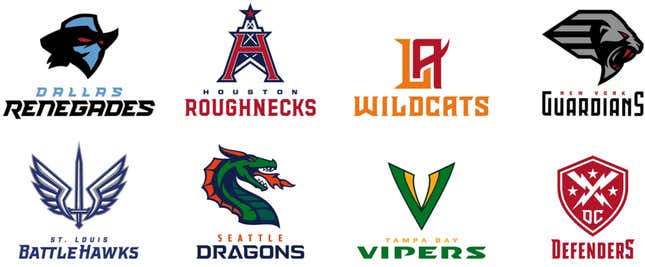
The names are, on the whole, bland as paste. If you can’t tell right off the bat from a team’s name whether that team belongs in the CFL or roller derby or Conference USA, you’ve fucked up. “BattleHawks” is, I think, the only half-decent name here, both because that’s not actually a thing and because it’s not clear what a BattleHawk would even be or do. Weird is good, and these aren’t weird.
The logos are similarly, disappointingly generic. They look like the teams in a direct-to-Netflix movie that opted not to pay up for real Arena Football rights. They look like the logos on SB Nation’s team sites. They look, more than anything, like the league announced the logo unveiling before realizing they hadn’t created any logos yet, and then quickly hired someone for not very much money to draw them all in a day.
(The logos are competent, sure. It’s important to make clear here that being “boring” is different than simply being “bad.” It’s worse.)
Most damning of all is that the logos all look like each other. I get that the XFL is concerned with brand identity, pushing the league rather than individual teams, blah blah blah. That’s everything the XFL should not be doing. A real “outlaw” football league—a real alternative to the NFL—should want its teams to show some personality in a way that NFL teams don’t and can’t, and a charmingly amateurish lack of consistency among the teams would go a long way to that end. Instead, we have eight teams that could’ve played in any failed spring football league that’s come and gone in the years since the first XFL came and went. That XFL, at least, got a lot of things right in the way its rebirth seems to be getting them wrong.
Let’s be clear about this: The original XFL was not great football and most of its rule innovations were bad ideas. It was not a very good product. But it isn’t purely nostalgia that makes it so fondly remembered 18 years later. Remember what I said about weird being good, especially for a league trying to define itself by what it isn’t? The original XFL was weird.
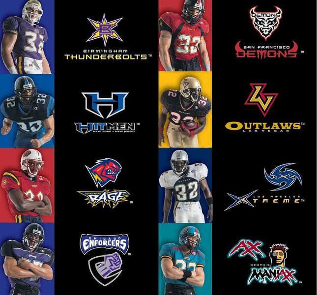
Not all of those names or logos were anything special, but the highs were infinitely higher, in multiple senses of the word. The Rage, with its roiding-out Frankenstein’s monster? The Xtreme, with a logo that’s part shuriken, part hurricane? The Demons, with the face of a demon who also has “Demons” written on his demon face? Literally everything about the Memphis Maniax?
Those were all, in varying ways and to varying extents, crimes against design and taste, but they also could not have existed anywhere but the XFL. You can’t say that about the logos revealed today, and the quickest thing that can doom this league’s reincarnation would be for people to have nothing to say about it. If the XFL isn’t going to be weird, will it have anything to offer?